Lumina
Ryan Untalan
Dec. 12, 2020 · 10 min
Overview
Project Description: Lumina is a flexible digital space divider that creates a personal work environment that promotes mental well-being. Lumina was created during a graduate studio course at the University of Washington.
Role: Product Designer and UX Researcher
Tools: Figma, Principle, Miro, Spline
Time Duration: 10 weeks
Project Context
For the University of Washington's MHCI+D ideation studio course, our cohort was challenged to take a speculative approach to designing for the home and household. My team and I aligned on creating a product that would help professionals who primarily work from home.
Design Challenge
How might we help professionals working from home improve their mental well-being by creating personalized ways to manage mental fatigue?
Design Response
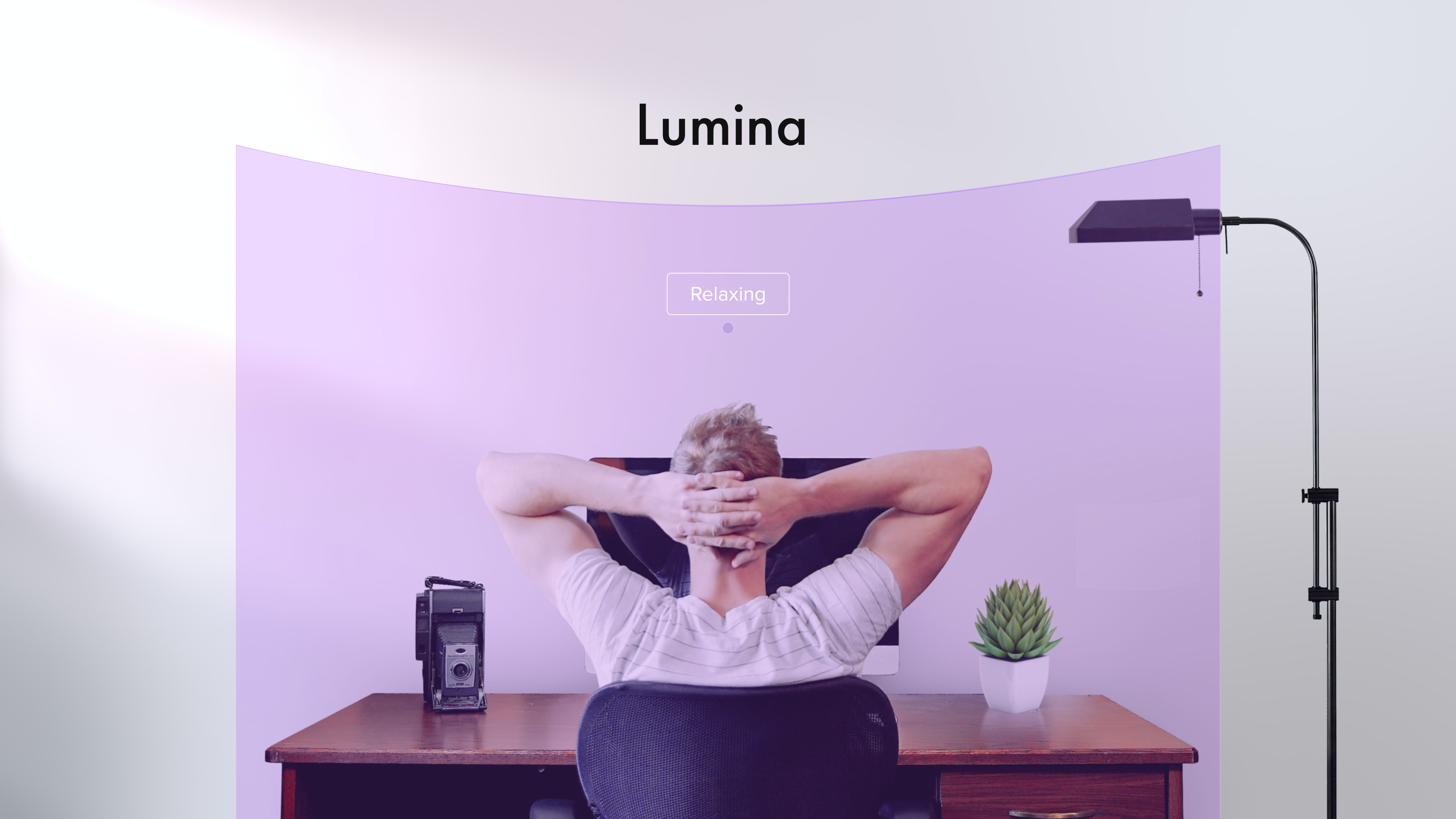
Lumina creates a personalized work environment that promotes mental well-being
Customize Lumina to suit your mood with the companion mobile app
Results
Our team won first place at our cohort design showcase, and Lumina was awarded the most innovative project.
Context Setting
Design Space
Support a mentally healthy work environment for professionals working at home. We defined professionals as employees who have to acquire, create, and apply knowledge for the purpose of their work; not manual labor.
Formative Research Summary
- Working from home is the new normal, and it’s here to stay. In an international survey of 2285 remote workers, 71% of managers and employees desire work-from-home options even after the pandemic is over.
- However, working from home can blur the boundaries between home and work, intrude both physically and psychologically on family time, and can encourage overwork and work preoccupation.
- The lack of dedicated workspaces, competing priorities at home, and increase in distractions, can lead to more mental fatigue and poor mental well-being.
Primary Research
Contextual Inquiry
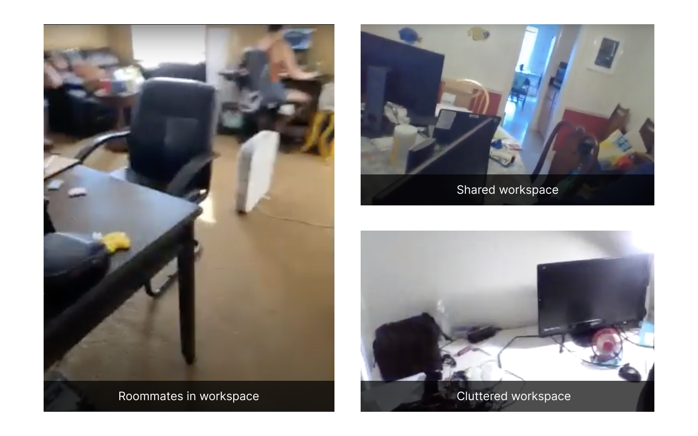
To further our understanding of professionals working from home, we conducted virtual contextual inquiries. Participants invited us into their homes to give us a virtual tour of their workspace and home environment and speak about how it affects their mental well-being.
Insights
- Professionals feel mentally healthy when they can do their best at work and take care of themselves.
- Mentally healthy means that you are in a good mindset to do whatever you need to do, to accomplish whatever tasks you have in a way that you don’t feel overwhelmed. -P1
- Working from home increases mental fatigue by making it difficult for professionals to separate their different life roles and responsibilities.
- When you are working from home, it all bleeds into each other. So it’s hard to separate that mentally. -P4
- Professionals who have to share their workspace with other people experience more mental fatigue when they have to adapt to find privacy and avoid distractions.
- When people come down the stairs, I'm hyper conscious of that... it's ever present in my mind. - P1
Desired Outcomes
From these insights we created 3 desired outcomes, to serve as a reminder throughout the design process that we’re working towards a design response that is based on the needs of professionals working from home.
- Reduce mental fatigue to save energy for work and personal activities.
- Improve the mental well-being of professionals working from home.
- Easy integration into any home.
Design Challenge
With these insights and desired outcomes in mind, we crafted the following how might we statement to guide us in ideation:
How might we help professionals working from home improve their mental well-being by creating personalized ways to manage mental fatigue given the limits of their home?
Ideation
Brainstorm 90 Ideas
In response to the design challenge, each of us sketched 30 ideas. We then plotted our 90 ideas on a 2x2 matrix and affinitized.
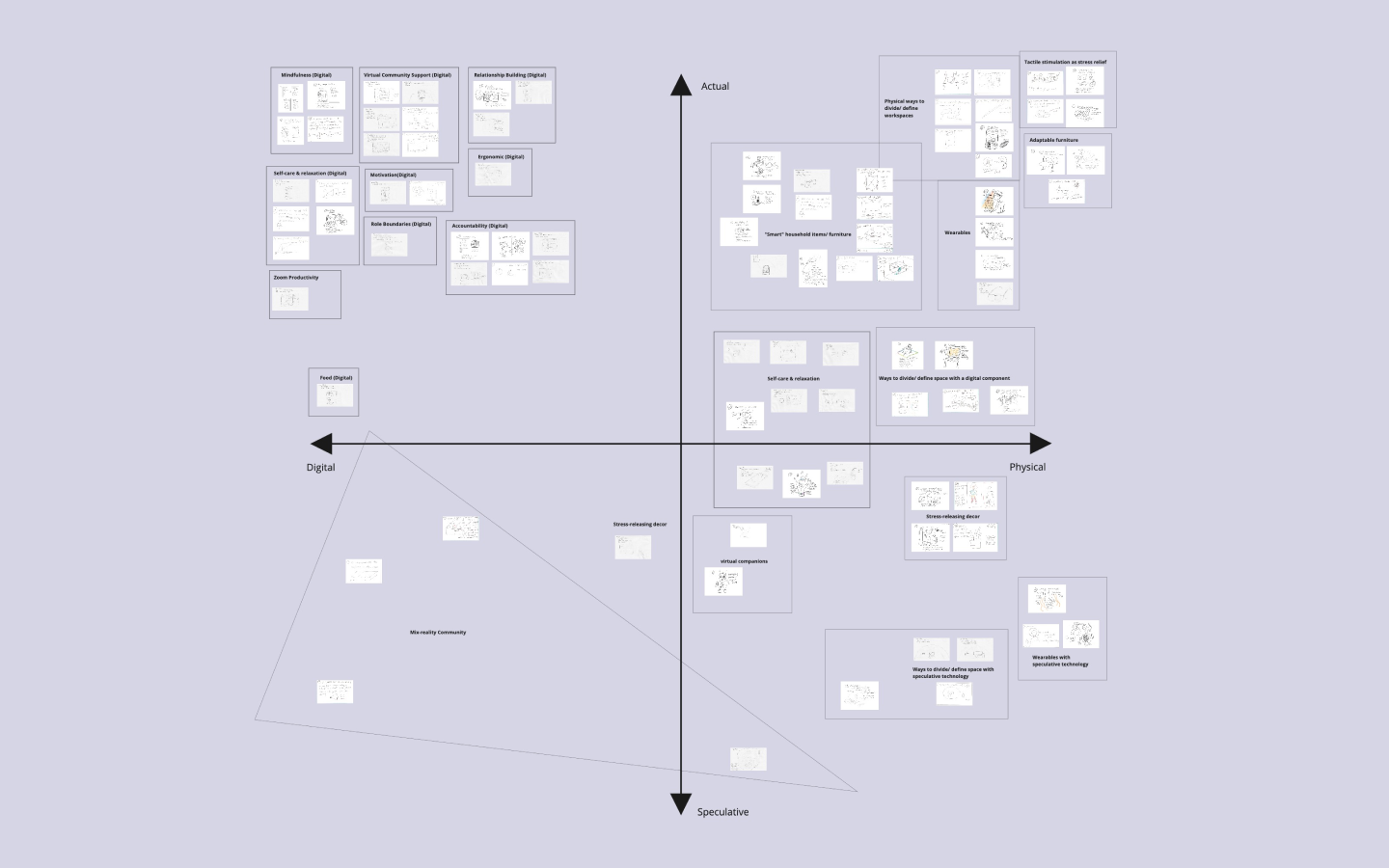
Down-Selecting with Dot Voting
We then used a dot voting method to narrow down our 90 ideas. Each of us voted for 5 ideas that either stood out or sparked interest. 10 ideas remained.
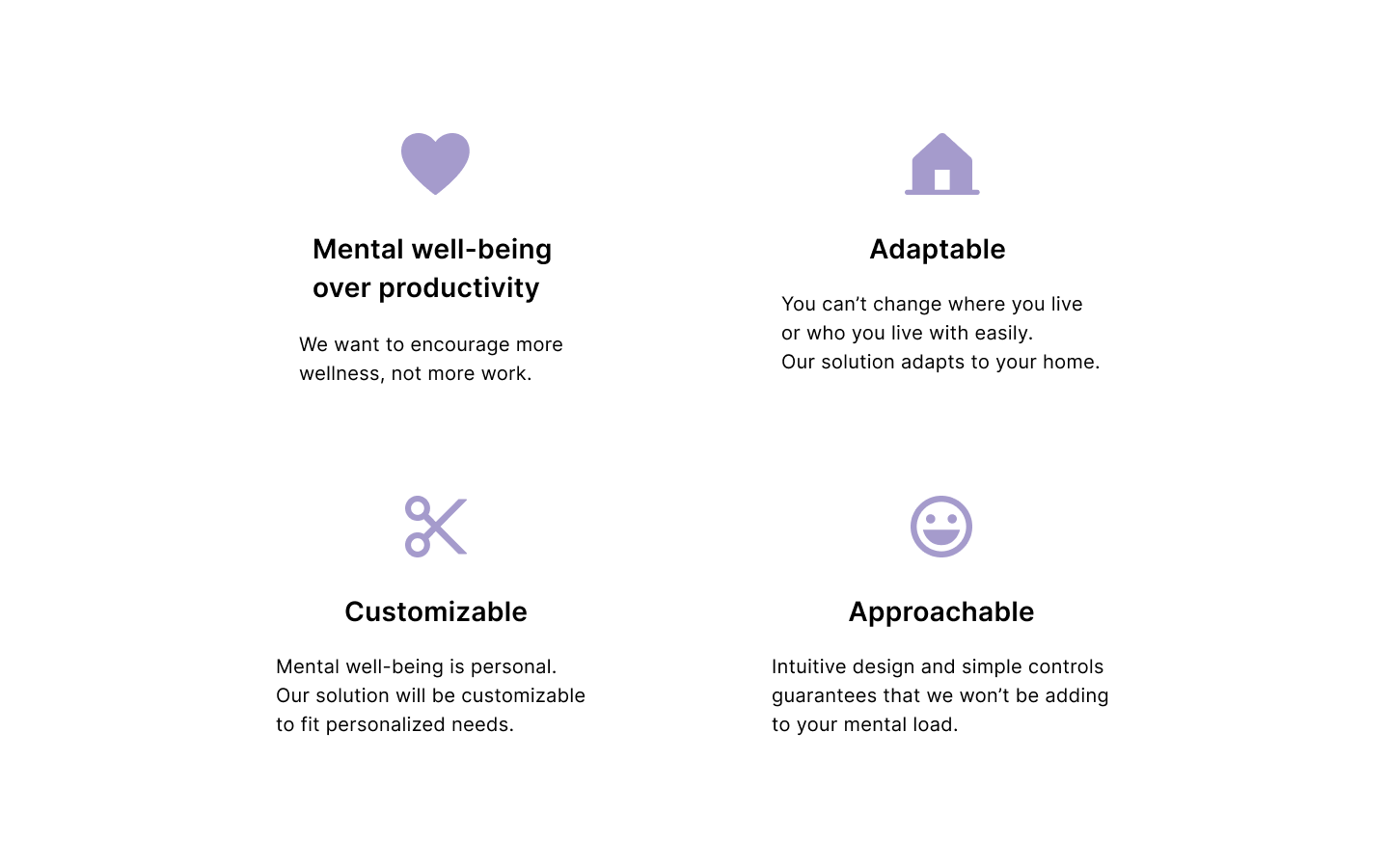
Design Principles
Leveraging our desired outcomes and insights, we crafted 4 design principles to help us further down select. Design principles are important in creating a shared evaluation language and helped my team and I align on our product values.
Top 3 Ideas
After discussing each idea, we narrowed down to our top 3 ideas.
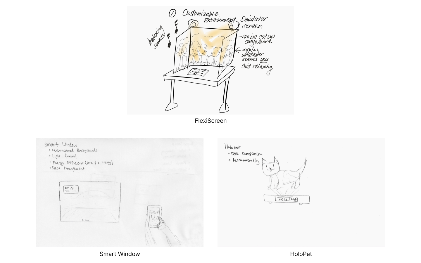
Storyboarding & Critiques
We refined and made a storyboard for each idea to illustrate the high-level experience. Then presented each concept to our peers and instructors. The critique session focused on two main things: which product addresses mental well-being the most and which product is the most exciting/ interesting.
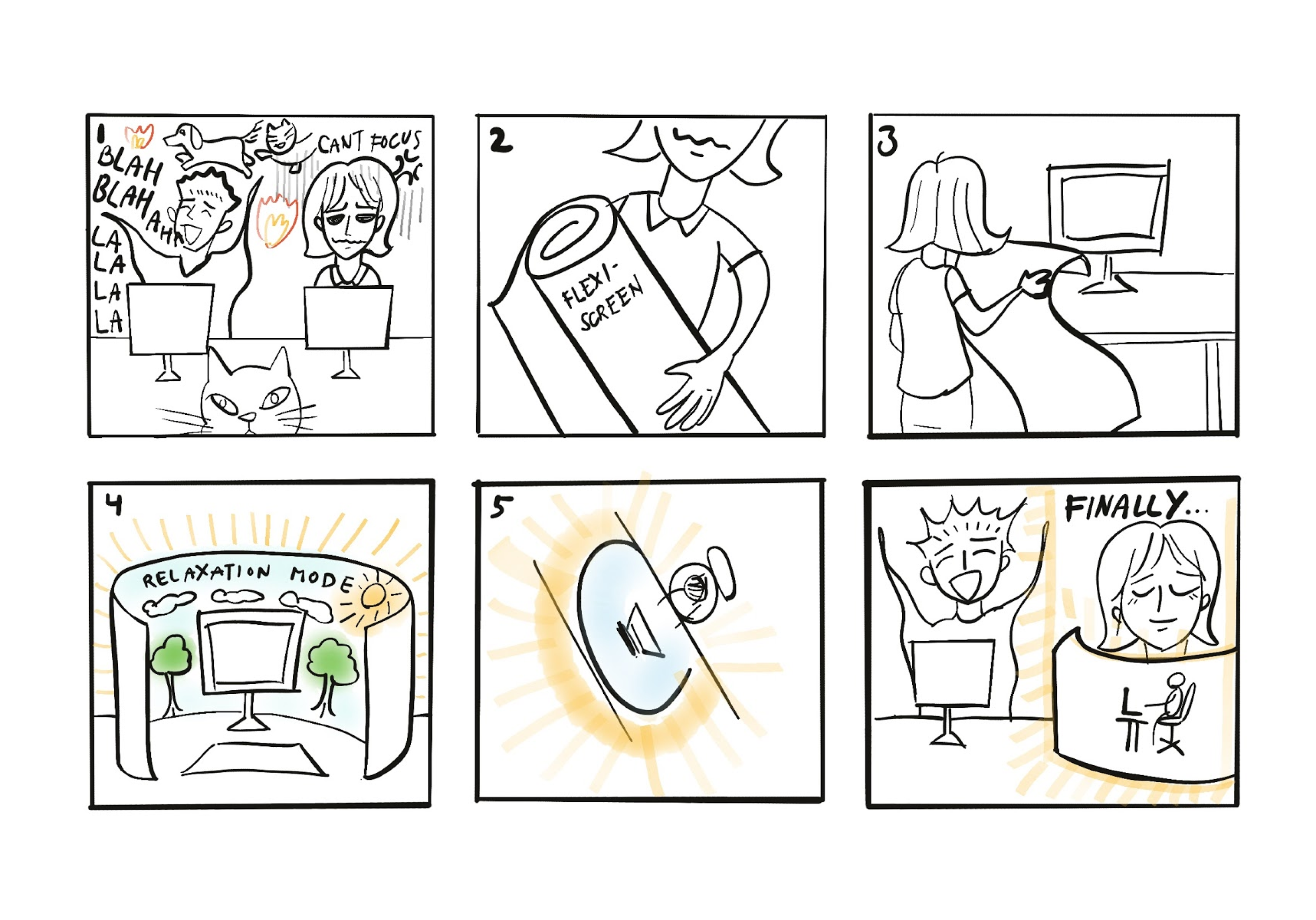
Moving forward with FlexiScreen
Based on the feedback, FlexiScreen evoked the most excitement and people felt that it addressed mental well-being the most.
Establishing a Design Direction
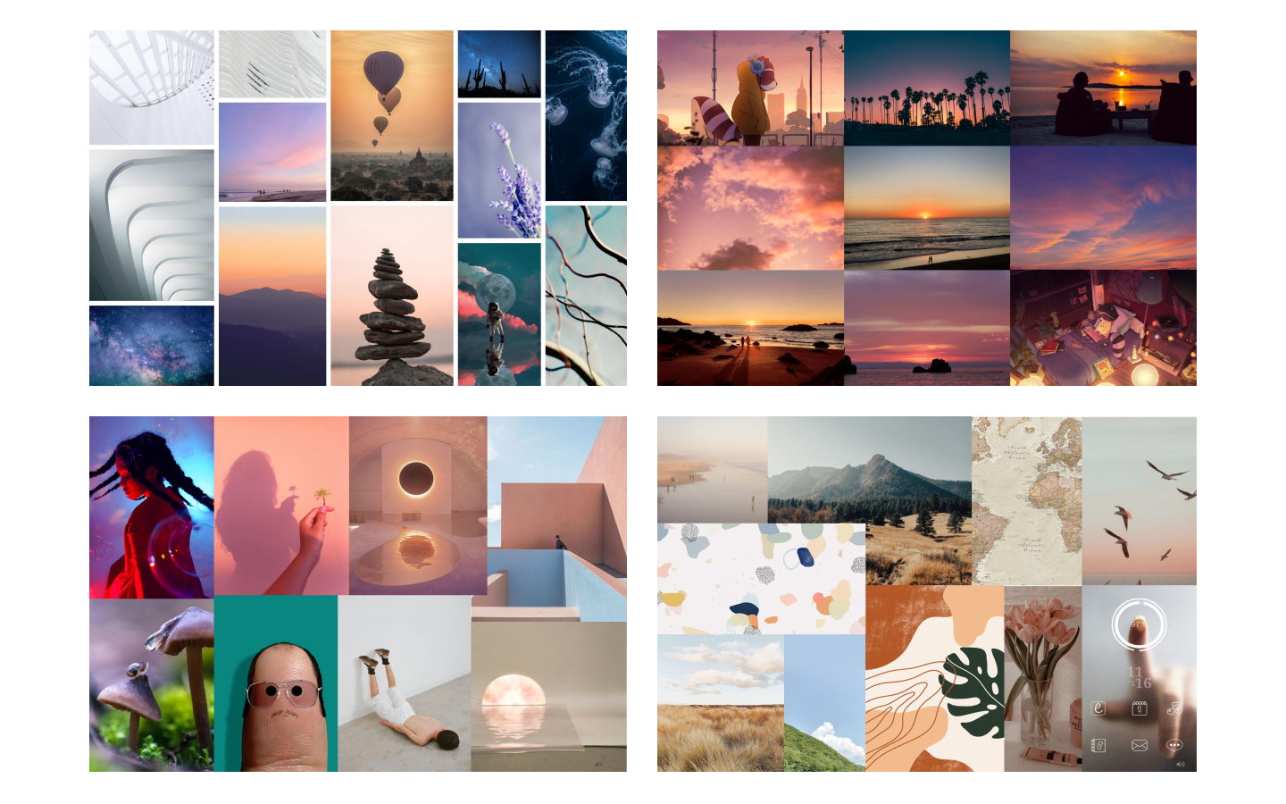
As we continued to refine our concept, it’s important to establish a design direction so that we're aligned on both the visual and emotional aspect of our product. I led my team through this process by first identifying our brand values. Through a brainstorming session, we generated words that represent our design principles. I then synthesized them into 4 brand values/ attributes: soothing, harmonious, personal, and approachable. We then dived into creating moodboards that represent those values.
FlexiScreen to Lumina
A modern look with soft and warm colors. We want to create a personal and soothing experience, with a clean and welcoming feel. Also, we decided to change the name of FlexiScreen to Lumina because Lumina felt more soothing and welcoming.
Refining the Concept
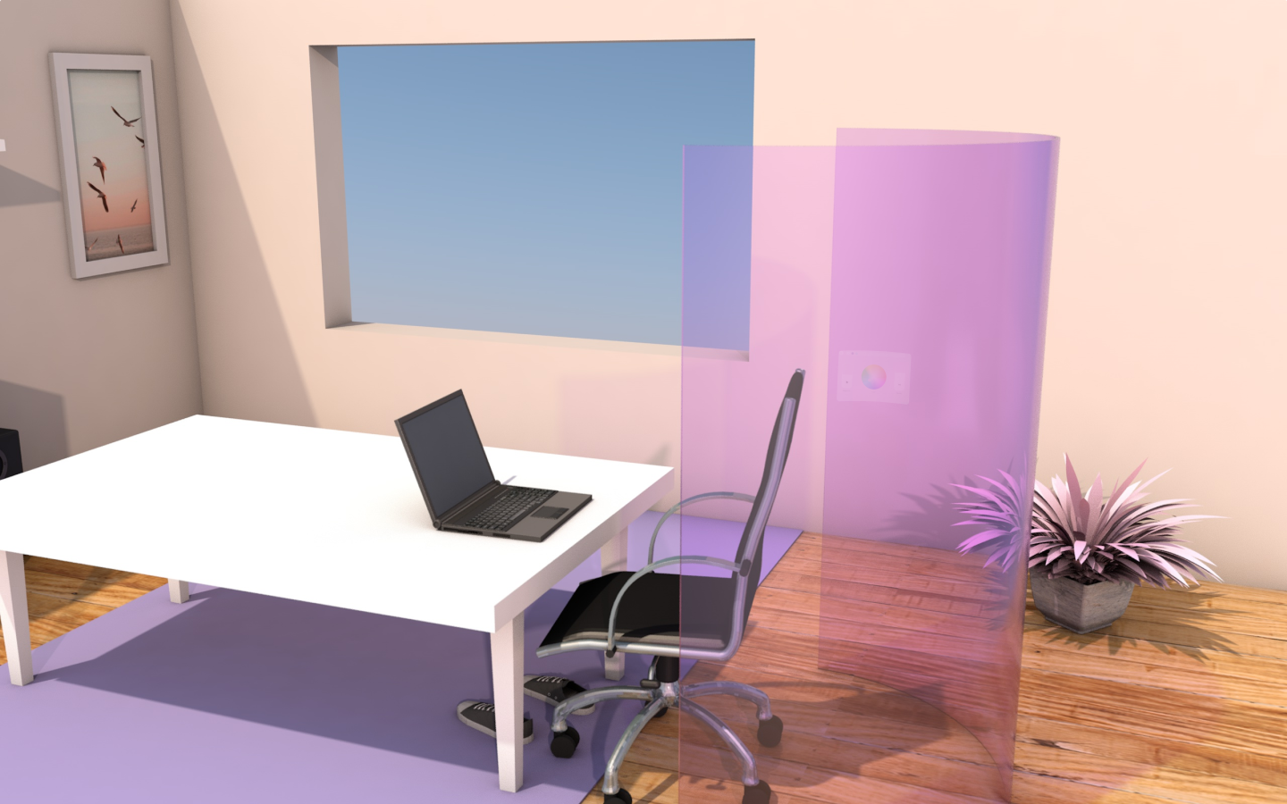
Lumina is a flexible digital space divider that creates a personal work environment that promotes mental well-being. By establishing both physical and mental separation in your workspace, Lumina gives you more privacy, less distractions, and better boundaries between your work and home.
Prototyping
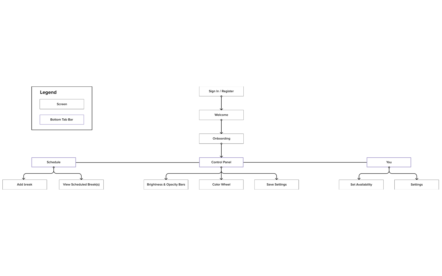
Information Architecture
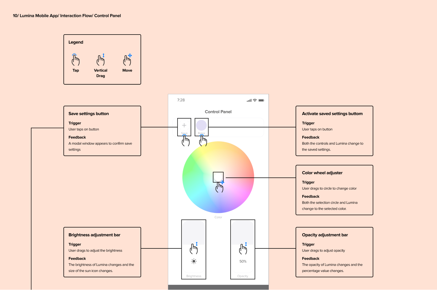
I created the mobile app information architecture to illustrate key interaction points which allowed us to get feedback and iterate before investing time into prototyping.
Key Path Prototype Planning
With the first iteration of our core concept and information architecture set, we begin prototype planning. We defined 3 key paths accompanied by a set of research questions to test with our low-fidelity prototypes. Prototype planning helped with establishing an aligned agenda on what questions we want to answer and helped ensure we’re using our time wisely when creating low-fidelity prototypes. Here are our key paths:
Key Path 1: Physically setting up Lumina and experiencing a new work environment
Key Path 2: Using the mobile application to customize Lumina and set up a schedule
Key Path 3: Communicating availability status to others while using Lumina
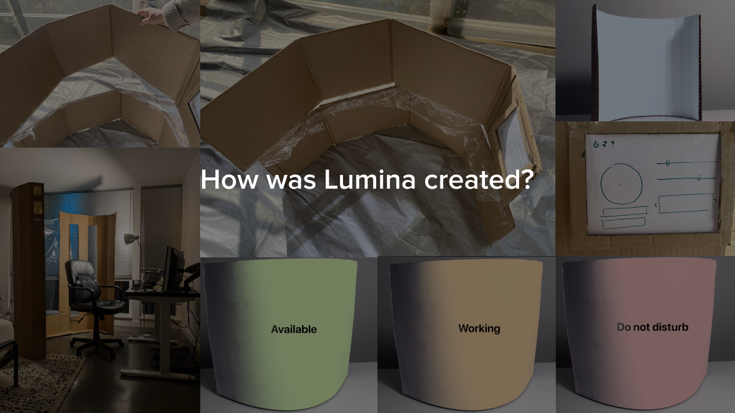
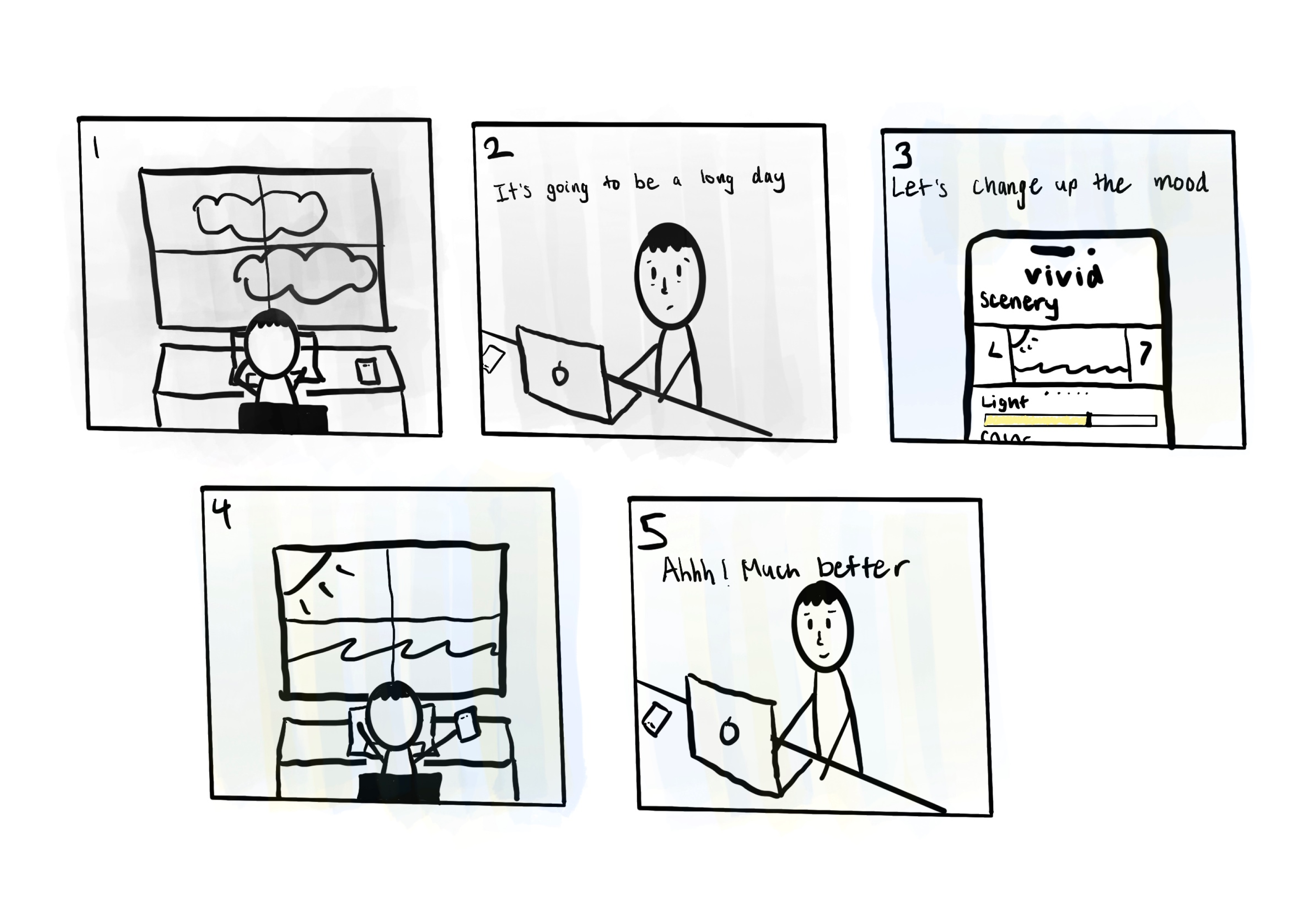
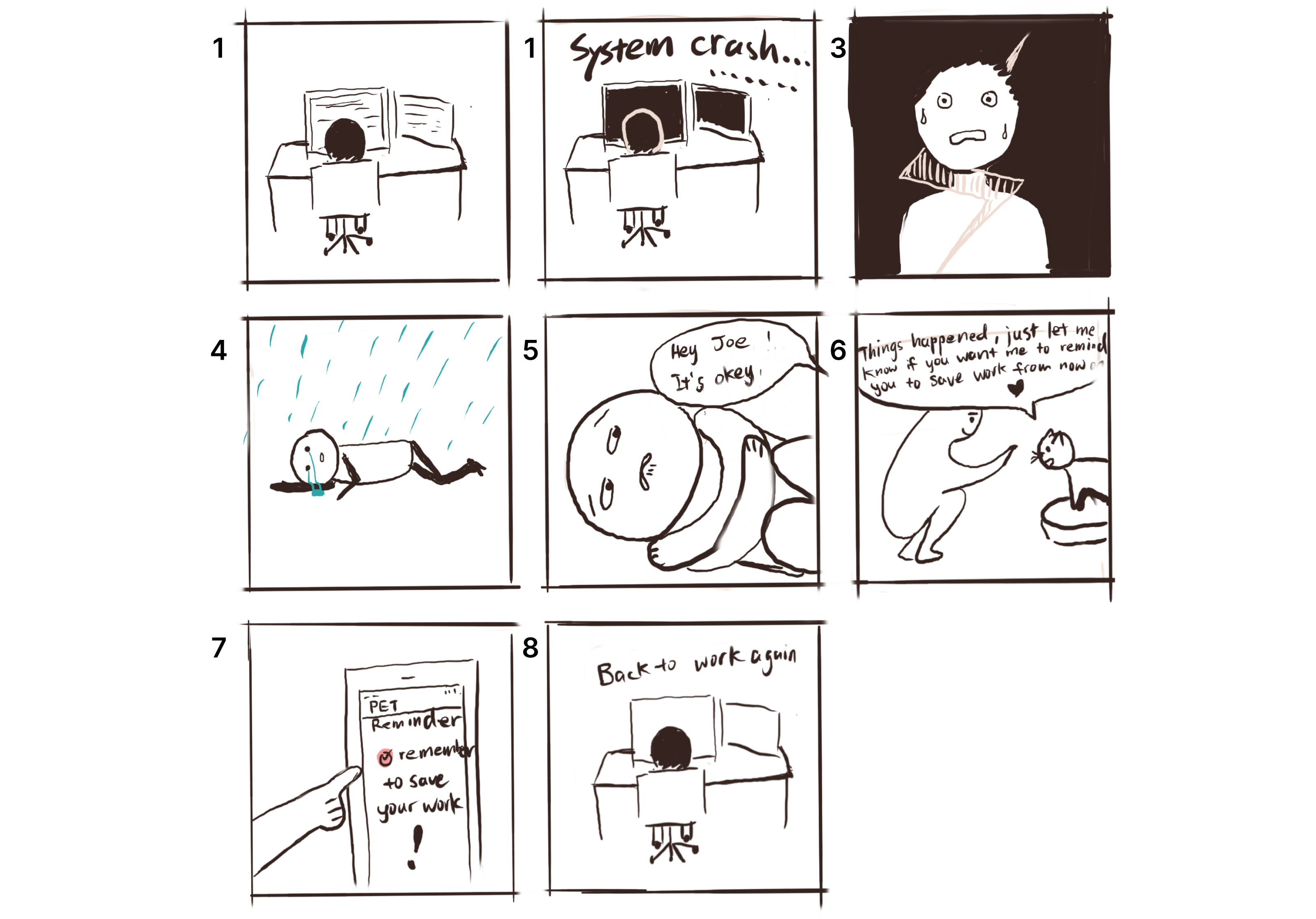
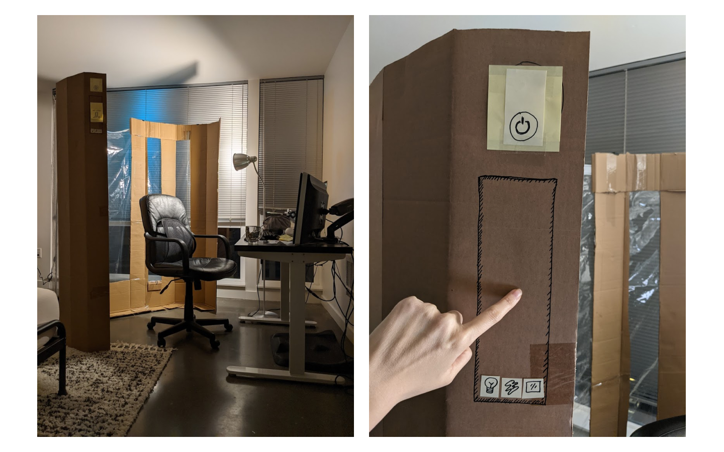
Prototype Insights & Next Steps
- Adjust how we present Lumina. We want to emphasize that Lumina is not a “screen” similar to a TV or monitor due to concerns about screen fatigue.
- Add a save custom settings feature. A save custom settings feature will help create a more personalized experience and streamline the process for finding the ideal settings.
- Keep the exterior simple. We want to ensure that Lumina is non-intrusive within the household. So keeping the exterior simple meant that the status message would be more subtle.
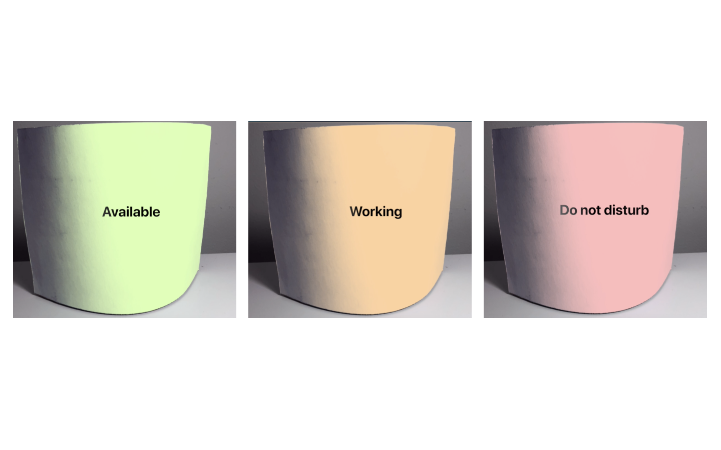
- Implement customizable texts. Instead of being limited to 3 statuses (do not disturb, working, and available) we learned that it would be better that professionals could create their own personal message on the exterior to help communicate various situations.
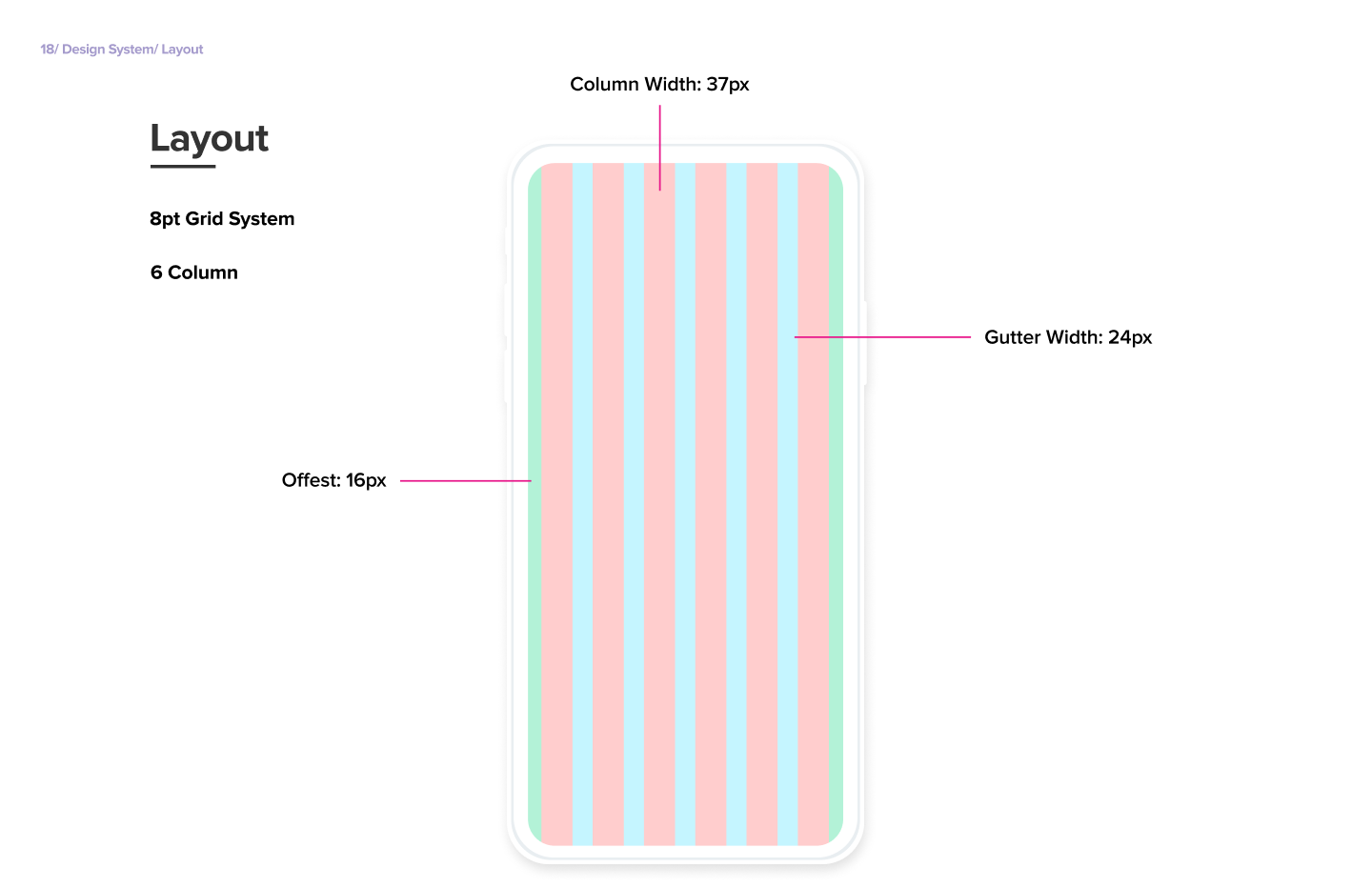
Design System
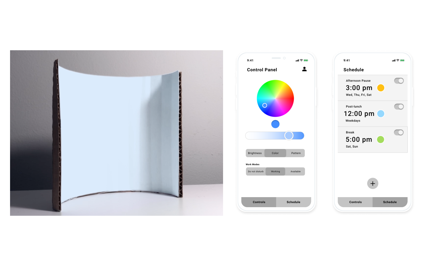
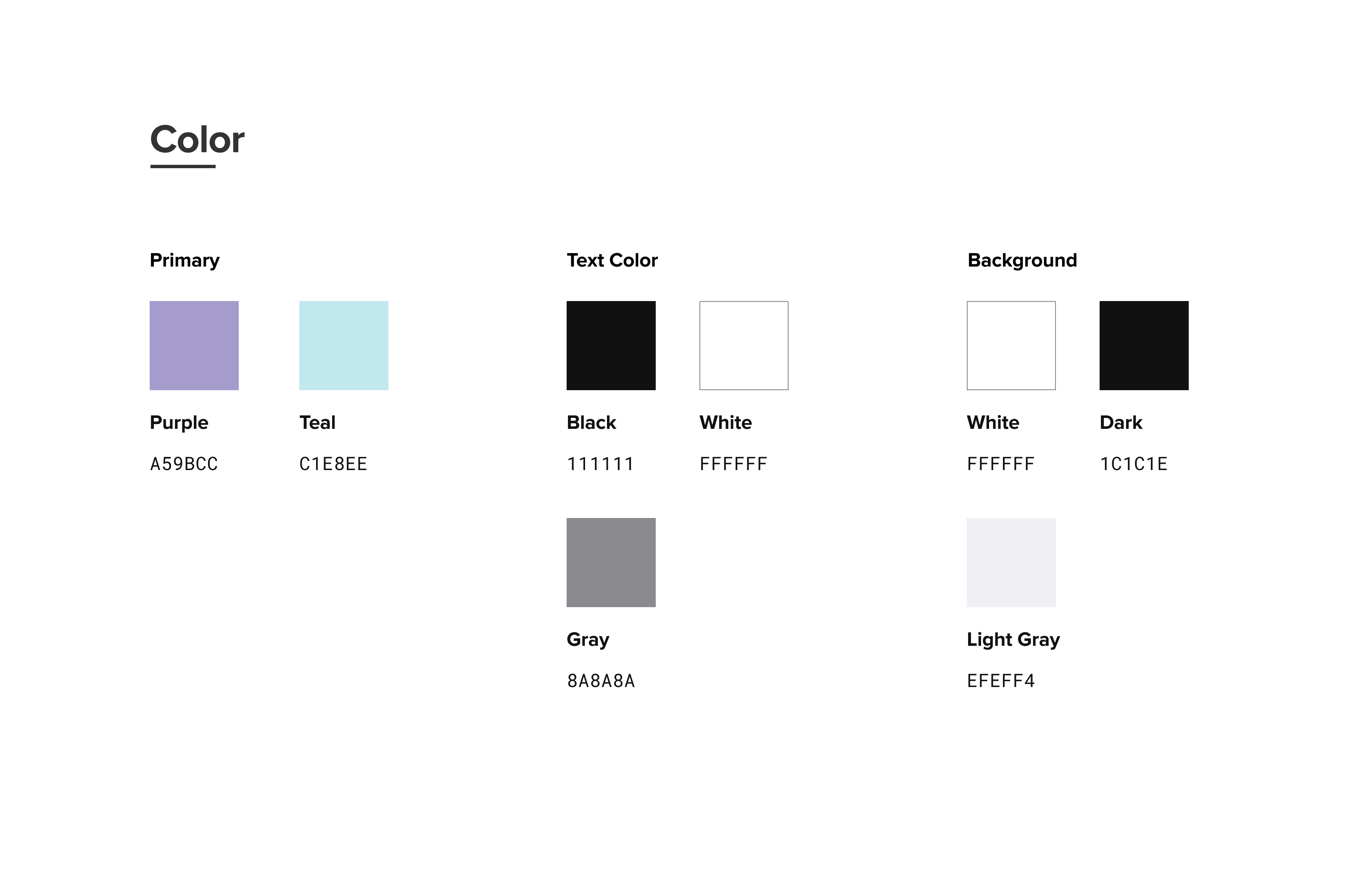
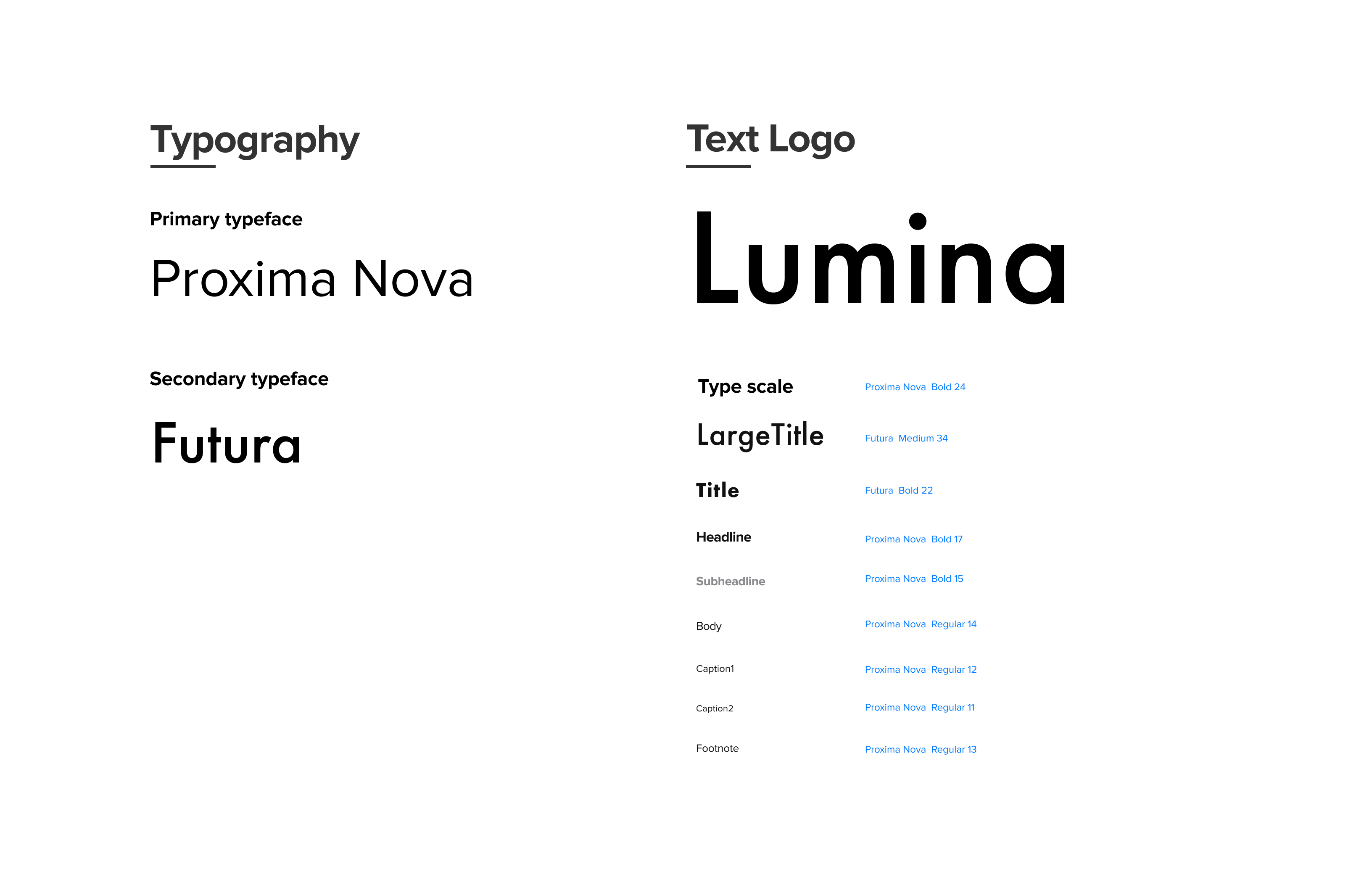
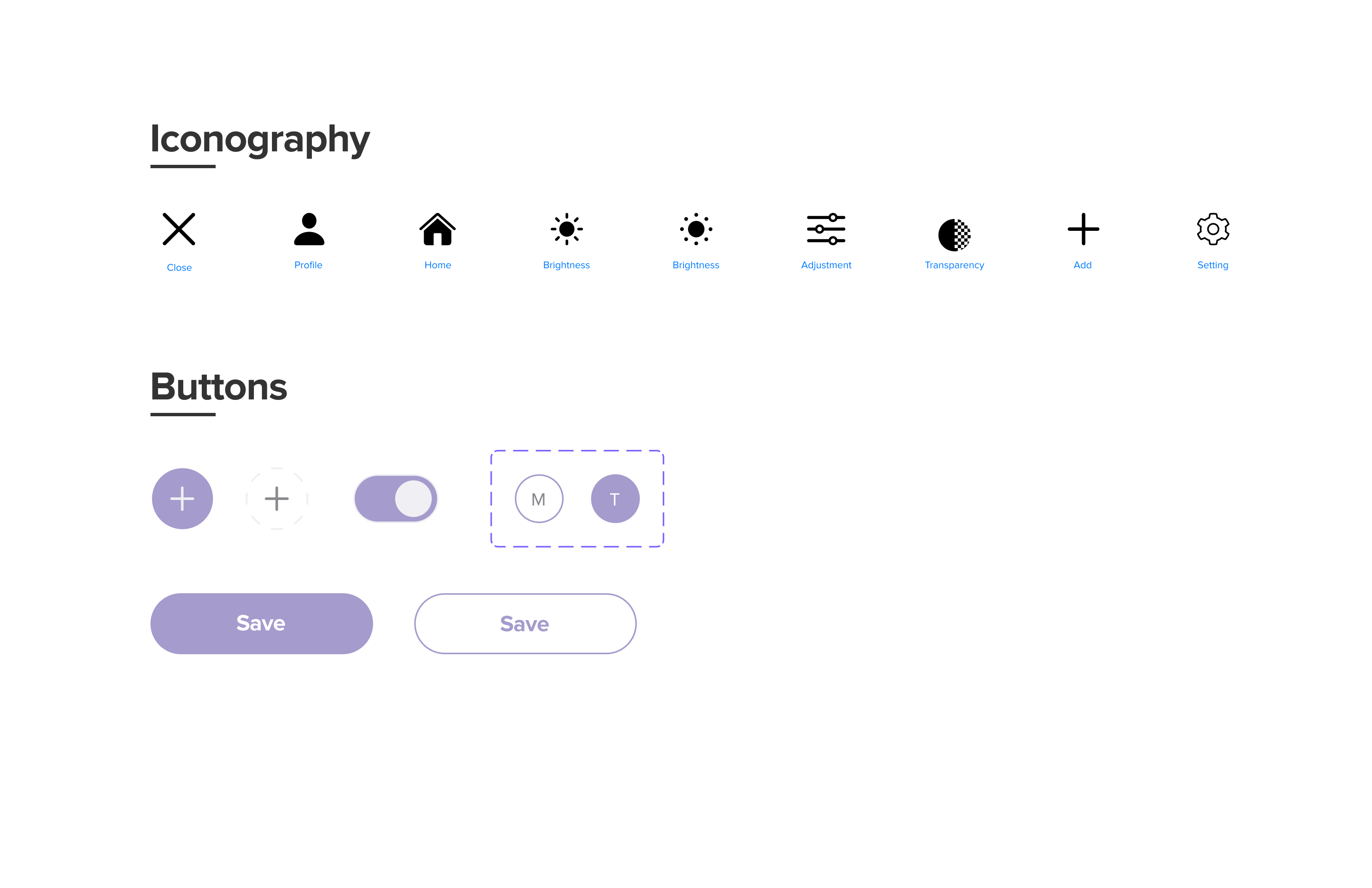
I created the Lumina mobile app design system within Figma. This helped ensure we have a cohesive visual design throughout the interface. The visual decisions were guided by our established design direction. We went with a light lavender purple as our primary color to create a soothing feel. We used Proxima Nova as our primary typeface because of its clean, modern, and friendly look.
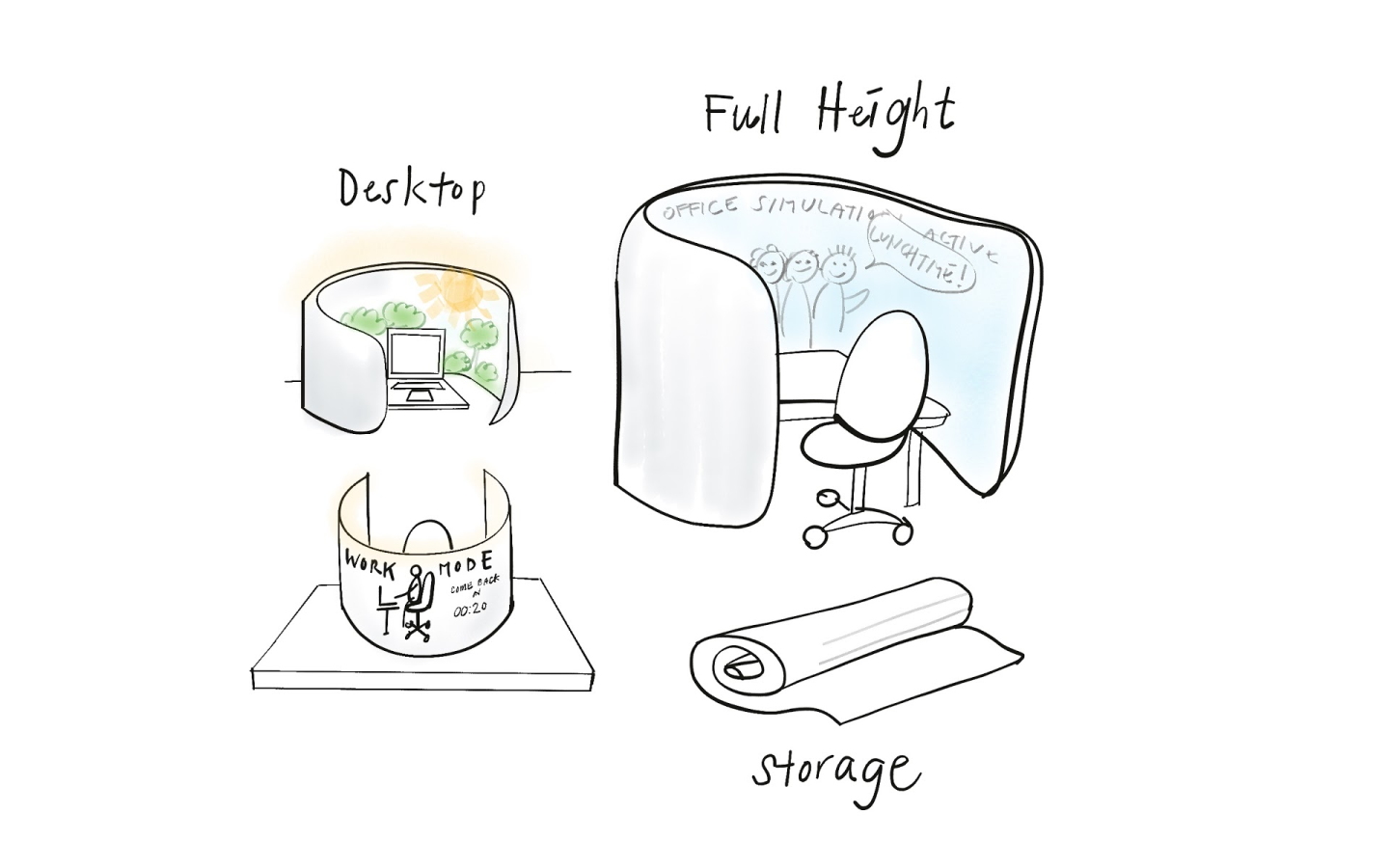
Key Features + Final Designs
Create a private workspace
Lumina creates both physical and mental separation in your workspace, giving you more privacy, less distractions, and better boundaries between your work and home.
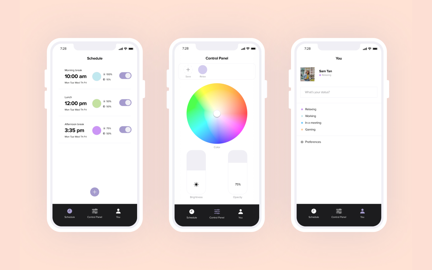
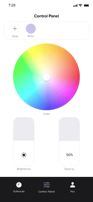
Personalize your Lumina
Use the mobile app or the interactive menu on Lumina to customize and save color, brightness, and opacity preferences to suit your mood.
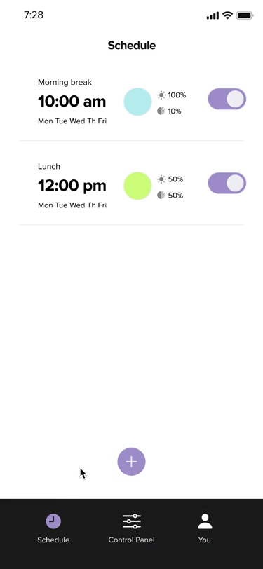
Schedule breaks
You can schedule Lumina to change at scheduled times to remind you to take breaks throughout the day.
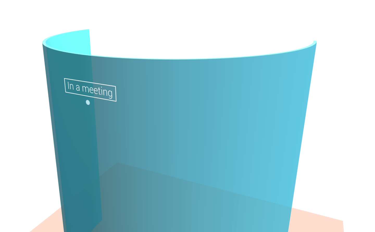
Communicate availability
Use Lumina to display a custom message to others in your home about your availability, minimizing mental fatigue from interruptions.
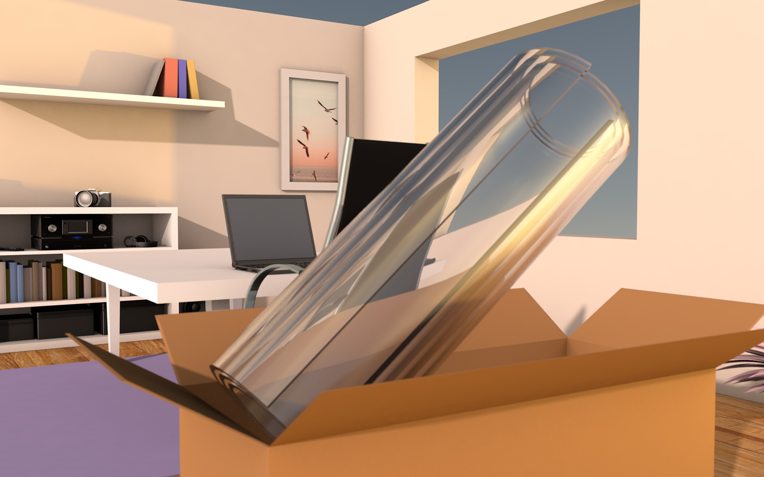
Storable
Lumina can be rolled up and stored away when you are done for the day, allowing your space to take on multiple purposes for work and life.
Specification Document
To wrap up the project, my team and I created a specification document to provide more details on Lumina’s visual, industrial, and interaction design.
Reflection
Ask why often. When designing a product, it’s important to understand the purpose behind a selected design method or design decision. Asking why often ensures that we’re checking the reasoning behind a decision and helps prevent biased/ uninformed/ blind decisions. In addition, by knowing and communicating our reasoning, we can get better feedback on decisions and it can check for assumptions.
Team alignment is an evolving process. Whether it’s through defining a design space, brand values, or core features, it’s important to encourage the sharing of ideas and engage in dialogue with each other to find alignment in order to move forward.
Thank you for reading!